# Breakpoints
Breakpoints are found at the top of the builder canvas. They define the screen widths (and other media conditions) at which your site's styles change. Webstudio is **desktop-first by default** — Base has no media condition and applies everywhere, and the default breakpoints use max-width to adjust styles as the screen gets smaller. You can change this by adding min-width breakpoints instead, making your project mobile-first.
For guidance on how to use breakpoints to build responsive layouts, see [Responsive design](https://docs.webstudio.is/university/foundations/responsive-design).
## Two types of width breakpoints
**Max-width breakpoints** apply styles when the screen is at or below the specified width. This is the **desktop-first** approach — you design for large screens first on Base, then add max-width breakpoints to adjust styles as the screen gets smaller.
**Min-width breakpoints** apply styles when the screen is at or above the specified width. This is the **mobile-first** approach — you design for small screens first, then add min-width breakpoints to adjust as the screen gets larger.
You can mix both types in one project if needed.
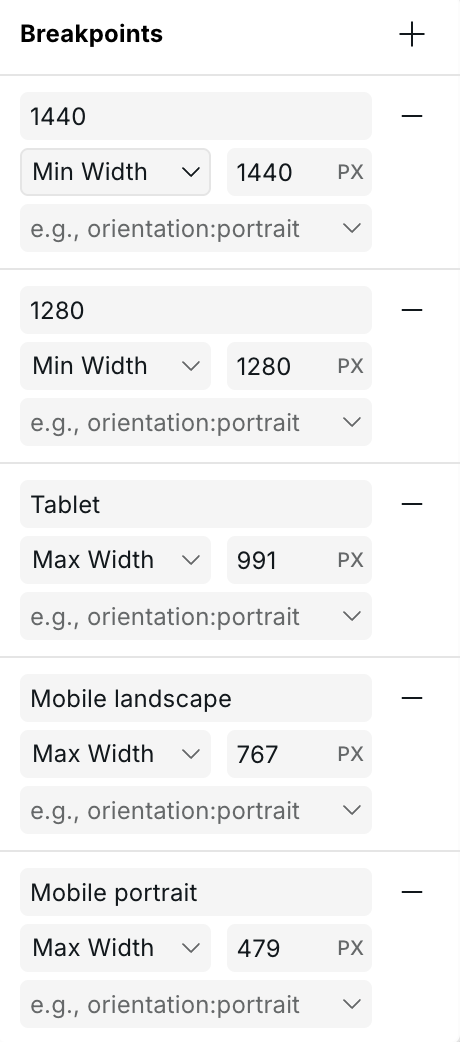
## Default breakpoints
The default breakpoints use the **max-width** (desktop-first) approach:
| Breakpoint | Condition | Description |
| -------------------- | ------------------ | --------------------------------------------------------------- |
| **Base** | None (default) | Applies to all screen sizes — the starting point for all styles |
| **Tablet** | `max-width: 991px` | Screens 991px wide and below |
| **Mobile landscape** | `max-width: 767px` | Screens 767px wide and below |
| **Mobile portrait** | `max-width: 479px` | Screens 479px wide and below |
## How styles cascade
Styles cascade **in the direction that narrows the match**:
* With **max-width** breakpoints: styles flow from Base (largest) downward to smaller breakpoints. A style set on Base applies everywhere; a style on the 479px breakpoint only applies at 479px and below.
* With **min-width** breakpoints: styles flow upward. A style set on a 768px min-width breakpoint applies to all screens 768px and wider.
Each breakpoint can override styles inherited from the previous one in the cascade.
## Adding a breakpoint
1. Click any breakpoint in the top bar to open the breakpoint menu.
2. Click **+** to add a new breakpoint.
3. Set a **min-width** or **max-width** value, or choose a **media condition** (see below).
4. Give it a label.
Editing a breakpoint
## Editing and deleting breakpoints
Click any breakpoint to open its settings. You can change the width, label, or media condition. Breakpoints can be deleted unless they are the base breakpoint.
## Custom media conditions
Beyond screen width, Webstudio supports any CSS media condition. This lets you style for user preferences and device capabilities:
| Category | Conditions |
| ------------------ | --------------------------------------------------- |
| **Color scheme** | `dark`, `light` |
| **Reduced motion** | `reduce`, `no-preference` |
| **Orientation** | `portrait`, `landscape` |
| **Contrast** | `more`, `less`, `no-preference` |
| **Pointer** | `coarse`, `fine`, `none` |
| **Display mode** | `fullscreen`, `standalone`, `minimal-ui`, `browser` |
### Example: dark mode
1. Add a breakpoint, select **Color Scheme: Dark**.
2. Label it "Dark".
3. Select it and style your dark theme — the canvas immediately previews dark mode.
4. The published site automatically switches based on the visitor's system preference.
### Example: reduced motion
1. Add a breakpoint with condition **Reduced Motion: Reduce**.
2. Disable or simplify animations for affected users.
3. Improves accessibility for users with vestibular disorders.
## Related
* [Responsive design](https://docs.webstudio.is/university/foundations/responsive-design) – How to use breakpoints to build responsive layouts
* [Style panel](https://docs.webstudio.is/university/foundations/style-panel) – Applying styles at each breakpoint
## Style label colors
When a breakpoint is active, style property labels in the Style Panel use color to show where a value comes from.
An orange label means the value is inherited from a larger breakpoint
See \[Label colors]\(anatomy-of-the-webstudio-builder.md#label-colors) for the full reference. Hover any label to see a tooltip with the exact source.
{% hint style="warning" %}
Mixing `min-width` and `max-width` breakpoints in the same project makes style cascading harder to reason about. Stick to one direction for maintainability.
{% endhint %}
## Related
* [Responsive design](https://docs.webstudio.is/university/foundations/responsive-design) – How to build layouts that adapt to different screen sizes
* [Style panel](https://docs.webstudio.is/university/foundations/style-panel) – Apply styles at the selected breakpoint
* [Label colors](https://docs.webstudio.is/university/anatomy-of-the-webstudio-builder#label-colors) – Full reference for property label colors
* [Project settings](https://docs.webstudio.is/university/foundations/project-settings) – Breakpoints can also be managed via Project settings